About Me

Hi, Im Leyla

Tuesday 9 April 2013

Q7 - Looking back at your preliminary task, what do you feel you have learnt in the progression from it to the full product?


From the preliminary task I think I have come a long way, because when completing the preliminary task I didn't do a lot of research into what the conventions were and into the layout of a front cover.  The reason why I dont think my front cover for the teachers magazines was very good was because I had trouble with laying everything out to make it look like an educational magazine for teenagers aged 11-18. Also looking back at the front cover there wasnt a lot on the page. Compared to my Bassline front cover everything fitted well and complimented each of the things on the page, and it looked like I have done a lot of research into the conventions of an music magazine.

Front Cover 

Masthead  


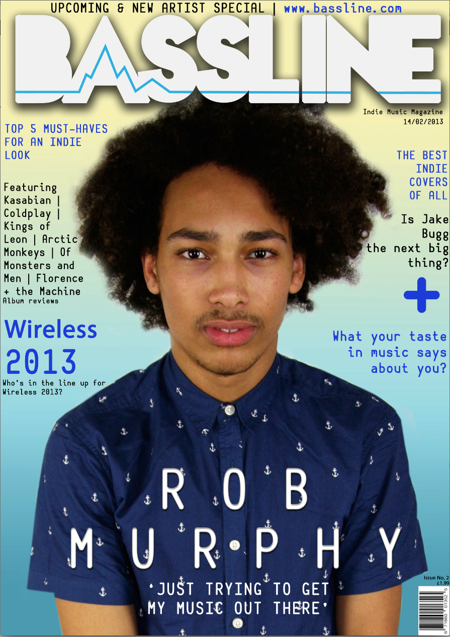
Looking at both of the mastheads from the teachers magazine to my music magazine there is a big difference. For the teachers magazine I used a very plain front for the masthead, now I can see that by having a pain masthead it wouldn't attract the audience and it brings the whole front cover down. The masthead for my music magazine is bold and stands out from the background, this masthead is much better than the teachers masthead because I have used a much more creative font which brings the magazine to life and makes it stand out from other magazines. To make my masthead for my music magazine even better and different I added an heart beat running through the text. When researching into different music magazines I noticed that they there mastheads were plain, so I made the decision to go against what was the norm and add the heart beat to the masthead. 

Main Image 
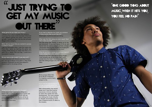
The main images for the teachers and music magazine I still think they both suit the subject of the magazines. The main image for the teachers magazine suits the magazine well because the model is holding a folder which is linked to school and education. Also the model is carrying her school bag, this shows what the magazine is about without even looking through the magazine. 
The main image on the music magazine front cover shows that what I have learnt from what I have researched. When I researched into the conventions for music magazines front covers I found out they always use a medium close up, the reason for this is because I think the shot holds all the detail that needs to be included on the front cover, also by using this shot it makes the magazine more personal to the reader and the eye contact draws you in to the magazine and makes you want to read it. Another reason why I think the music magazine front cover is better because the image is cut out well and it looks professional compared to the top magazine. 

Layout
From looking at the layout of each front cover, I can see that I have learnt a lot from the preliminary task because the teachers front cover there was not a clear layout and where everything was placed there is not a balance on the page. The difference with my music magazine front cover is that I had done a lot of research into the layout of front covers, what looks best, positioning of the text, main image and masthead. By looking at the music magazine front cover you can tell that I had done a lot of research into what it should look like and conventions. 

Colour Scheme
On the teachers magazine front cover there was not a clear colour scheme on the page, this brought the front cover down because the colours I did use were dull and didn't match the subject of the magazine. The background was very dull for the teachers pet magazine, this was because I didn't add an background and I just used the background for the image. There is a major difference between the magazine because the background for my music magazine is very bold and bright, and this would attract the audience to my magazine. Also all the colours on the front cover match and go well together which shows that I have thought about what colours to use. 

Contents Page 


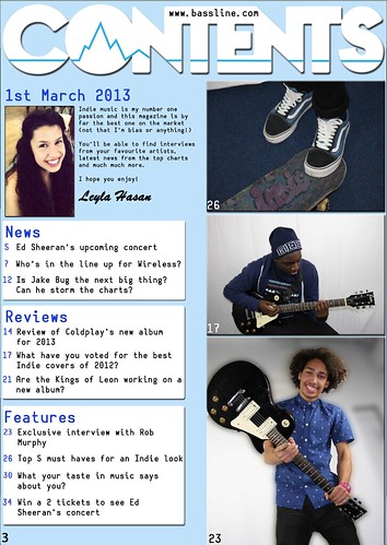
 From looking at both the contents pages I can see a major difference between the two. The contents page for the teachers magazine although there is a clear layout for the text and the images it looks very plain and there isn't a lot of colours used on the page. Also on the page there is a lot of blank space, which have been filled up if I thought about the layout more, and placed the text and images in difference places. 

Colour used
The top contents page there is a very limited amount of colours used, the only colours I did use were white, black and yellow. The colour black and white are very simple colours which didn't stand out but I think the colour yellow added some brightness to the page but it did still look bland. 
My music contents page although it use many bright colours I still think it is better because they colours work well together and they match the genre of music chosen well. 

Photos 
The photos I have used in both contents pages go well on the page and they link to the subject of the magazine. The photos I have used on the music magazine I added an outline to make the photos stand out even more from the background. 


Q6. What have I learnt about technologies from the process of constructing this product?

6. What have I leant about technologies from the p by leylathasan on GoAnimate

Animation Software - Powered by GoAnimate.


For our front cover and contents page we had to use the program Adobe Photoshop to create them, luckily for me I do photography so I knew how to use the programmes. Photoshop allowed you to import photos and edit them how you want for example changing the photo to black and white adjusting the colour balance etc. On the other hand the programme for the double page spread I had a lot of problems with because it was the first time I used it, and I thought it would be similar to Photoshop because they made from the same makers. The programme that I leant most about was Adobe InDesign, at first I didn'tt know anything about this programme so I decided to look on YouTube about how to use the programme. For me looking at videos I learn best from because I can see how it is done and then I try it for myself. The things I leant how to do in Adobe InDesign was to produce a double page spread for my magazine by importing the photos I wanted to use, arranging the text and photos to make the page look professional. Also I leant how to resize a photo that I imported, making it smaller or bigger, this was really important for my double page spread because at first I only wanted my photo to cover one page but I then had to resize my photo so it could fit over the double page spread, the reason why I had to resize the photo was because it would have become stretched and pixelated.
To take the photos that I displayed in my magazine I used a canon 4D camera, this camera allowed my to take photos on a automatic focus or manual setting. I chose to use the manual focus because I find using this setting it allows you to control how much light you let in and how close you want to be near the subject. Also with this setting I think the picture quality is much better and more clear. 

Other technologies I've learnt have been the website blogger, this website allowed us to create our blogs and this blog shows the progress towards the finished product at the end. With blogger I have leant how to post text or images which have shown that I have leant by making my music magazine.
All the technologies I have used to creating my magazine or finding my music artist have been: Blogger, Photoshop, InDesign, Twitter, Prezi, GoAnimate, YouTube and PowerPoint.
The equipment and props I used during the process: Canon eos 40D camera, photography studio with lighting equipment, Apple Mac pc, Tripod, Skateboard and guitar. 


Wednesday 3 April 2013

Final draft of double page spread 


Final draft of contents page 


Final draft of front cover 


Analysing my double page spread 
My double page spread is the favourite part of the magazine because I feel that it is very strong because the image is very good and also the layout works very well. 

Photo
The photo used in the double page spread I think makes it because the photo links well to the genre Indie through the clothes the model is wearing and the instrument he is holding. I edited this photo in Photoshop further by just blurring the background because before blurring the background the model didn't stand out enough, so blurring the background was a good decision. Originally the photo was going to be on only one page but because the photo is landscape it didn't fit on one page well it was either too small or become stretched when I tried to fit it. Although at first I didn't like the photo on both pages but when I added the text and the quotes, I think it look right and everything works together. 

Fonts 
The fonts I used for the quotes was the same as the ones I used for the mastheads for the front cover and contents page. This fonts fits very well to the genre Indie because it's different and it would appeal to the younger audience which my magazine is aimed at. For the interview I changed the font because at first I experimented using the font I used for the quotes but because the writing was so small in the font you couldn't read what the writing said. So I decided to change it to a simple font that could be read easily. Also another reason why I didn't want to use a creative font was because I didn't want to distract from the main image. 

Colour scheme 
For the double page spread I wanted the colour scheme be kept simple but to also match colours in the photo. Black and white were the best colour choice to use for this page because they were simple and they went well with the photo. Also I think by using them colours it made the page look slick and polished. 

Analysing the contents page 

The contents page I found the hardest to make because getting the layout right, including the right amount of text, choosing the correct pictures I found it hard to get everything right and to make sure everything worked together. 

Background 
The background colour I wanted to link to the front cover, and this would be a theme running throughout my magazine. The reason I chose to have the background colour blue was because it was the colour I wanted to be in every page in my magazine. Also the colour blue appeals to both girls and boys, the colour suited my magazine well because I wanted my magazine to appeals to both girls and boys. Also the colour blue doesn't distract from the text and the photos, this was a reason why the colour blue was the best choice. 

Masthead 
The masthead I chose to use the same font as the front cover to keep things simple but make it look good, I also had the heart beat line running through the masthead as well, these elements I used showed the themes that it was all part of the same magazine.
Originally I didn't have a black outline around the masthead but noticed that without an outline the masthead just blended in with the background and it didn't stand out. The black outline added depth to the masthead and it now stands out against the background. 

Editors Note  
I wanted to include an editors note on my contents page, because when researching into different music magazines started noticing conventions that music magazines stuck to and an editors note was one of them. In the editors note I wrote about how important the genre Indie was to me and also gave a brief description what was included in the magazine. 
Next to the editors note I included a photo of myself because on every contents page I looked at included a photo of the editor and I wanted to stick to the convention. 

Photos 
All the photos I included on the contents page I wanted them all the link in with what I have written for the pages for my magazine. The photo of the vans and the skateboard I created in Photoshop because originally the skateboard didn't have the graffiti  on it, so I added it onto the skateboard using the eraser tool in Photoshop. Each of the photos were edited in photoshop to either touch them up or blur the backgrounds so the attention wasn't taken away from the model. 

Text 
The font I used on my contents page, front cover and double page spread was Belshaw, I think this font fits in very well with the genre Indie because it is different from other fonts and it's unique. Some of the text I placed on top of a white square box, this drew your attention to the vital information first because of the boxes. 
Masthead

My masthead was the part of magazine I couldn't decide on, I had about 10 different fonts that I couldn't choose from and I experimented with everyone one them, but none of them looked right on my magazine front cover. 
At this point become stuck with my front cover so I chose to finish everything else on the front cover and find the masthead last. I began researching different music magazines again and noticed that the magazines based around my genre I chose just used big chunky fonts, so this directed me to look at bold and chunky fonts. I came across this font on the website 'Dafont' and thought that it fitted in very well with the genre of music my magazine was based on, I chose to keep the colour white because it stood out from the main image and the background colour. Originally I didn't have the heart beat across the masthead but added it after I finished the whole front cover. This made my masthead more stronger and more effective because the name of the magazine was shown through the heart beat, and it was just like a bassline. 
Magazine I used as influence for my front cover


When researching and analysing different music magazine, I came across the magazine front cover at the top of the page called 'Clash'. I really liked everything about the magazine front cover from the masthead to the main image and the colour scheme. 
Before the name of the artist was placed on the left hand side of the page but I noticed that by placing it in the middle people would look at it first before anything else and it was the pull factor of my magazine. I left the masthead where it was because I didn't want it to cover the main image because I feel that it is the most important item on the page which would attract readers to but the magazine. 

I added the top line of writing just above the masthead which was influenced by the 'Clash' magazine. The top line I would say is a pull quote, this was used to also attract the readers and it was giving a short amount of information of what the magazine is about. I also included the website of the magazine, this was a convention I learnt from the magazines I was looking at, and decided to include it at the top of the page with the pull quote. 

The background of the 'Clash' magazine played a big part in changing the background of my magazine. Before the background of my magazine was light blue, but the magazine didn't stand out and didn't look professional. So I decided to change it to a gradient background using the colours yellow and blue. This decision I made was a very good one because the front cover doesn't  look boring and now I think it would stand out against the other music magazines on the shelf. 

Monday 11 March 2013

Decision made to change my front cover

       
My finished magazine front cover on the left, didn't stand out enough and didn't look like an Indie Magazine. The title was very plain and the font I used was also plain, boring and didn't make the magazine look exciting. The magazine front cover on the right looks so much better and it looks much more like an Indie magazine mainly I think because of the background colours. The word Indie is associated with bright colours and having a unique style. I changed mostly everything on the corrected front cover but used the same photos for the main image, I just cut the subject out again mainly because the hair looked too cut out and now the photo looks a lot better and the hair doesn't look like its dramatically cut out. 

I also changed the lettering of the master head, the font is now bold and stands out against the colours in the background, also added a base line into the font as well this in my opinion makes the name of the magazine seem more real. 

Wednesday 27 February 2013

Editing my photo for the contents page
I first started out with opening the image I wanted into Photoshop.
 
 I then found an image on Google of the word 'Indie' written in graffiti. I opened this image and placed it on the skateboard, and erased the picture that went off the skateboard. This is the finsihed photo, which I will be using in my contents page.  


Tuesday 26 February 2013

My magazine so far


Interview Corrected
 
What genre do you class your music?
I always find it hard to answer this one. I suppose the music I write has been influenced from different genres and artists I have grown up with. Certainly at the moment you could say that I fall into the Acoustic Singer song writer category. As well as being into playing the acoustic guitar I also have big influences in electric guitar and the blues so I try to combine the two. Ideally one day my music will be with a full band, to get the most out of the music but still including acoustic and electric guitar influences.
 
When did you know that you wanted to peruse a career in music?
I got my first guitar when I was four years old. I don’t remember why I asked for one but I remember being adamant it had to be a real guitar and not one of those toy ones. It was a classical guitar and massively too big at the time for my tiny hands and arms. I grew up learning the guitar and singing whilst playing so really from then on it grew into a dream that one day, I could be a successful Musician.  
Do you have a role model? If yes who is it? 
I was obsessed with Nirvana and Kurt Cobain from the age of about 13 to well 17. I still love Nirvana but I’m not trying to sound like them these days. They have certainly influenced me and have played a massive part in my song writing.
Where do you see yourself in 10 years?
In ten years time I want to be sitting on a beach with a cocktail strumming a guitar and making a life out of music. The music industry is a difficult place to break into but I would always regret not giving it a good go. In the next ten years various songs and albums will be released along with various shows and radio slots to promote.
What was the first song you ever sang? How did it make you feel?
The first song was ‘Daddy is taking us to the Zoo Tomorrow’. If you don’t know it, it’s an old rhyme that we used to sing at primary school. I remember learning the chords and singing for the first time and showing it to my mum. The first song I ever performed in front of a group of people was probably Streets Of London by Ralph Mctell.
If you had to describe the music you produce in three words what would it be?
Meaningful, Mysterious, Provoking.
What has been your biggest challenge in your music career so far?
The constant hurdle of getting people to hear about your music. There are so many people who want to be a musician or star and it can be very hard to have your music heard or often it can be judged before it’s even heard.
If you had the opportunity to change something about the music industry what would it be?
Well unfortunately now record labels don’t have the finance, resources or time to develop an artist who needs that early development.  Too many people are robbing the music industry by illegally downloading which has had a massive knock on effect to the industry. Before they were able to make lots of money from C.D sales, something that has been devastated by downloading.  Now artists must tour extensively to earn money. This means that Record Labels are now looking to find artists that can prove they are already selling records and have all the other necessary attributes, because they are less of a financial risk factor.
Sometimes I wonder if anyone gets signed anymore just because they have raw talent - I certainly hope so.
What do you think makes you and your type of music unique from other artists?
Everyone has their own way of doing things, writing chords, lyrics etc. Also every individual artist has been influenced by a different collection of artists which contribute to their own sound.  I can honestly say all my music that I write comes from the heart. I don’t ever force a song or writing - it’s something I do when I don’t mean to; pick up the guitar play some chords come up with a melody and the song starts to develop. I’ve always said that I feel that writing songs is my way of keeping a diary because all my songs reflect bits of my life as it happens.  I think that combining the lead guitar with acoustic guitar and my various influences I’m creating a sound that’s unique to me.


In todays lesson...
In todays lesson, I have gone through what I have done in the holiday's with my teacher Ms Silva and she has given me feedback on how to improve my interview and my front cover.
 
Things I need to change in my front cover is to add or take words out of the interview, this will make the sentences make more sense.   
 

Thursday 21 February 2013

Interview Questions Answered

What genre do you class you music in? 
I always find it hard to answer this one. I suppose the music I write has been influenced from different genres and artists I have grown up with. Certainly at the moment you could say that I fall into the Acoustic Singer song writer category. As well as being into playing the acoustic guitar I also have big influences in electric guitar and the blues so I try to combine the two. Ideally one day my music will be with a full band, to get the most out of the music but still including acoustic and electric guitar influences.

When did you know that you wanted to peruse a career in music? 
I got my first guitar when I was four years old I don’t remember why I asked for one but I remember being adamant it had to be a real guitar and not one of those toy ones. It was a classical guitar and massively too big at the time for my tiny hands and arms. I grew up learning the guitar and singing whilst playing so really from then on it grew into a dream that one day, I could be a successful Musician.  

Do you have a role model? If yes who is it?
I was obsessed with Nirvana and Kurt Cobain from the age of about 13 to well 17. I still Love Nirvana but I’m not trying to sound like them these days. They have certainly influenced me and have played a massive part in my song writing.

Where do you see yourself in 10 years? 
In ten years’ time I want to be sitting on a beach with a cocktail strumming a guitar and making a life out of music. The music industry is a difficult place to break into but I would always regret not giving it a good go. In the next ten years various songs and albums will be released various shows and radio slots to promote.

What was the first song you ever sang? How did it make you feel?
The first song was ‘Daddys’ taking us to the Zoo Tomorrow. If you don’t know it, It’s an old rhyme that we used to sing at primary school. I remember learning the chords and singing for the first time and showing it to my mum. The first song I ever performed in front of a group of people was probably Streets Of London by Ralph Mctell.

If you had to describe the music you produce in three words what would it be? 
Meaningful, Mysterious, Provoking.

What has been your biggest challenge in your music career so far? 
The constant hurdle of getting people to hear about your music. There’s so many people who want to be a musician or star It can be very hard to have your music heard or often it can be judged before its even heard.

If you had the opportunity to change something about the music industry what would it be?
Well unfortunately now record labels don’t have the finance, resources or time etc. to develop an artist who needs that early development.  To many people are robbing the music industry by illegally downloading which has had a massive knock on effect to the industry. Before they were able to make lots of money from C.D sales, something that has been devastated by downloading.  Now artists must tour extensively to earn money. This means that Record Labels are now looking to find artists that can prove they are already selling records and have all the other necessary attributes, because they are less of a financial risk factor.

Sometimes I wonder if anyone gets signed anymore just because they have raw talent I certainly hope so.

What do you think makes you and your type of music unique from other artists?
Everyone has their own way of doing things, Writing chords, lyrics etc. Also every individual artist has been influenced by a different collection of artists which contribute to their own sound.  I can honestly say all my music that I write comes from the heart. I don’t ever force a song or writing it’s something I do when I don’t mean to, Pick up the guitar play some chords come up with a melody and the song starts to develop. I’ve always said that I feel that writing songs is my way of keeping a diary because all my songs reflect bits of my life as it happens.  I think that combining the lead guitar with acoustic guitar and my various influences I’m creating a sound that’s unique to me.

Looking through the answers to the questions, It gives me an insight to what is it like to be an artist and also how hard it really is. To include most of the questions and answers, I have to shorten the answers leaving the most important information.